🔝To translate this blog post to your language, select it in the top left
Google box.
Types of data professionals
I have designed this Salary Data Comparator to know the salary of
data professionals:
-
Data Analyst: Helps make decisions by analyzing, cleaning and transforming data.
-
Data Scientist: Knows statistics, big data, algorithms, scientific computing, etc.
-
Data Engineer: It is capable of designing databases, analyzing and processing
segmented information (data pipeline), etc.
In this animated image I compare the salaries in the USA vs Italy of these 4
types of data professionals.

I show the salary range between the minimum and the maximum salary, with the
option of also showing the average salary, which is the most common among
professionals in the two chosen countries.
Who gave me the idea of comparing salary data?
The Italian
Roberto Mensa is the greatest charts expert I know, so he has managed to be
Microsoft Excel MVP.
His specialty is "doing the impossible" with Excel charts, and he
demonstrates it in his Gallery:
A few weeks ago he published a radar chart with the Types of Data
Professionals:
In addition to the radar chart, with the skills of the 4 types of data
professionals, it also represents the popularity of these professionals in a
line chart, and the salary range of these 4 professions in a scatter chart,
in thousands of US dollars ( k$).
It does not specify whether the salary ranges are worldwide or what country
those salaries are from. It is assumed that they are from the United States,
since their salaries are considerably high compared to those in European
countries.
I have uploaded Roberto's file to my OneDrive cloud with his
authorization.
To adjust cloud zoom:
-
On your mobile or cell phone, use two fingers on the screen, like you do
to enlarge or reduce a photo.
-
On the PC, place the cursor inside the search engine and press the
<Control> key by turning the mouse wheel.
I have simply made the following changes to the
Roberto's salary range chart:
- Salary range with the average salary marked with a diamond 🔶
- Option to show average salary.
- List of countries to compare.
- Selection of one or two countries.
- Labels of the types of professionals to the left of zero salary.
- Salaries in a country or comparator of salaries in two countries.
- Dynamic chart title to show the names of the countries compared.
-
Comparator in 6 languages: English, Spanish, French, Italian, German
and Portuguese.
-
Exchange rate of 3 types of currencies: Euros (€), Pounds sterling (£) and
American dollars ($).
Salary comparator data
The first thing I did was obtain the salary range data of the 4 types of
data professionals for 9 countries, along with their average salary, and I
saved them in a table on the 'Data' sheet:

I have decided to compare the salaries of 7 European countries, Mexico and
the United States, to make it more international.
I obtained these annual salary data, in thousands of euros (k€), by asking
the AI of Microsoft Copilot on Bing, with some Prompts that I am not going to reproduce here.
The AI responded with salary data imported from various sources in
thousands of euros (€), as I requested.
When the currency rate changes, it will be necessary to update it in the
cells in yellow background, with the conversion rate from pounds sterling
(£) and US dollars ($) to euros (€).
Transformation of salary data
Roberto Mensa's version uses the latest Excel features, such as
functions LAMBDA
y
LET, to obtain the series data from the chart.

The hidden sheet 'Support' contains the formulas for the scatter plot with
straight lines and markers, with which the salary ranges are represented. In
cell Q2 is the Spilled dynamic array formula
with the X values of the series. In cell Q7 is the formula with the Y
values of the series.
These formulas are very elegant and complex, since they ensure that the
headers with the names of the series and their data are generated with a
single formula.
The biggest problem is that using the LAMBDA function limits the chart to the versions of Excel for Microsoft 365
and Excel for the web, so it is not compatible with older versions of Excel.
It also adds a level of difficulty for Excel users who are unaware of these
new functions, so there will be few who understand them and even fewer who
can modify the functions of cells Q2 and Q7.
I haven't even tried to analyze and understand those formulas! and even
less modify them!
Roberto, we need a detailed explanation of those formulas to
understand them!
I am in favor of designing spreadsheets compatible with all possible
versions of Excel, from Excel 2010 to Excel for Microsoft 365, since my
followers are scattered around the world and many do not have the most
recent versions of Excel installed. Which forces me to use functions common
to all those versions of Excel and check compatibility following these
guidelines:
My Salary Data Comparator transforms the data in the hidden
'Auxiliary' sheet.

The pivot table for the A:E columns has the data source in the salary table
of the 'Data' sheet.
The pivot table for the M column contains the Average (Yes/No) option.
The auxiliary table of the range G1:K8 are the X values of the scatter chart
series, obtained with formulas compatible with the GETPIVOTDATA function, that returns visible data from the dynamic salary table.
The auxiliary table of the range G12:K19 are the Y values of the scatter
chart series, obtained with the auxiliary formulas of the range H11:K11 and
the value of cell G22, to know if it has been filtered by a single country
or by several countries.
Since the ranges H5:K5 and H16:K16 are empty, the straight lines that would
join a salary range of the first country to be compared with the salary
range of the second country disappear.
The value -50 in cell G11 is the X value of the series labels with the names
of the 4 types of data professionals. This way the labels with the low
values of the salary ranges do not overlap in the scatter chart!
The chart title is obtained in the G21 and J21 cells.
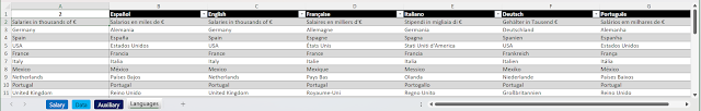
Salary Data Comparator Languages
In the 'Languages' sheet there are the translations into the 6 languages
of this Comparator:
Salary Data Comparator Chart
The Salary Data Comparator is represented in a single XY scatter chart with straight lines and markers.

Salary ranges are represented with 4 data series, one for each type of data
professional.
The labels of each type of professional are represented with 4 other data
series.
The origin of these series are the auxiliary tables discussed in the
previous section.
The range values are united by lines of different color for each of the 4
types of professionals.
The minimum and maximum values are marked with a circle 🔴 and the average
values with a diamond 🔶.
The X axis goes from 0 to 250, in thousands of euros (€).
The Y axis goes from 2 to 18 and is not visible. It is used to separate the
8 possible visible salary ranges in the Salary Data Comparator, shown in the
following image:

This is the result of comparing the salary ranges of the 4 types of data
professionals from 2 countries.
With 3 segmentations you achieve:
- Filter from one to four types of data professionals.
- Filter by one or two countries.
-
Filter the option to show (Yes) or not show (No) the average salary.
To change the language of the Salary Data Comparator there is a drop-down
list in cell S2.
ATTENTION:
After a Language change you must update chart with:
Data > Refresh All (Control + Alt + F5)
ATTENTION: Update Currency if the language changes.
Cloud Salary Data Comparator
I've shared the Salary Data Comparator in the Microsoft OneDrive cloud, so it's easy to test even if you don't have Excel installed on
your computer.
To adjust cloud zoom:
-
On your mobile or cell phone, use two fingers on the screen, like you do
to enlarge or reduce a photo.
-
On the PC, place the cursor inside the search engine and press the
<Control> key by turning the mouse wheel.
NOTICE: The changes you make in my cloud are not saved. To save your changes you
have to make a copy in your OneDrive cloud.
Download the Salary Data Comparator
The Salary Data Comparator is compatible with versions from Excel
2010 to Excel for Microsoft 365 and Excel for the web.
Download the latest version from this link:
Open the file and press the button: Enable Editing when the
PROTECTED VIEW prompt appears.
Sheets and workbook are protected without password, so you can study and
analyze the formulas, and view the hidden sheets.
ATTENTION: You can modify this Excel
workbook respecting this license:

CC BY-NC-SA 4.0 Deed | Attribution-NonCommercial-ShareAlike 4.0
International | Creative Commons
Other graphs with salary ranges
This page is a classic on salary charts, so I can't help linking it here:
Do you know other types of Excel charts with salary ranges? Comment
please!


No Response to "Salary Data Comparator"
Leave A Reply
Comenta este artículo, critícalo o avisa si detectas algún error que haya que corregir.